|
While making my two assignments on color theory, I had faced many challenges. It took a long time to find a group of colors that went well together. Some achievements that I achieved were finding good complimenting colors, and searching for a pleasant shade of varying colors. I used a variety of tools including the pen tool and a mixture of shapes using the compound tool. I just came up with random shapes at first and ended up with a star and circle. Color names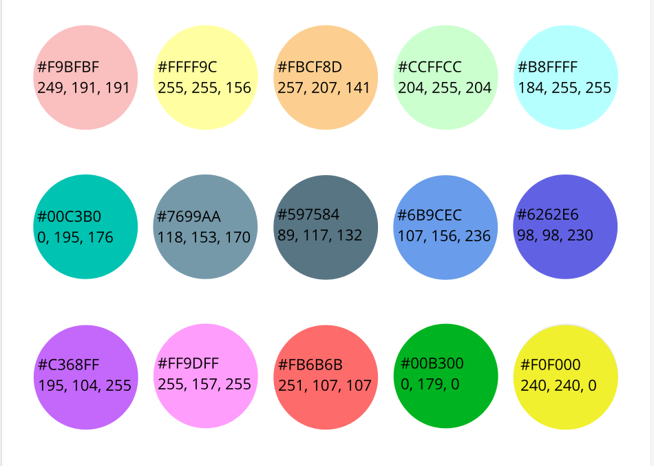 Color schemes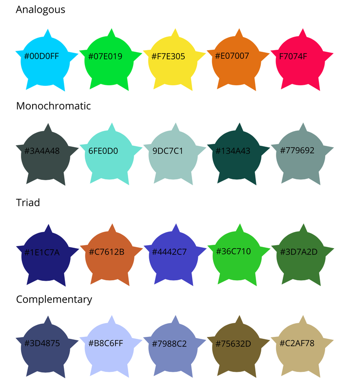
0 Comments
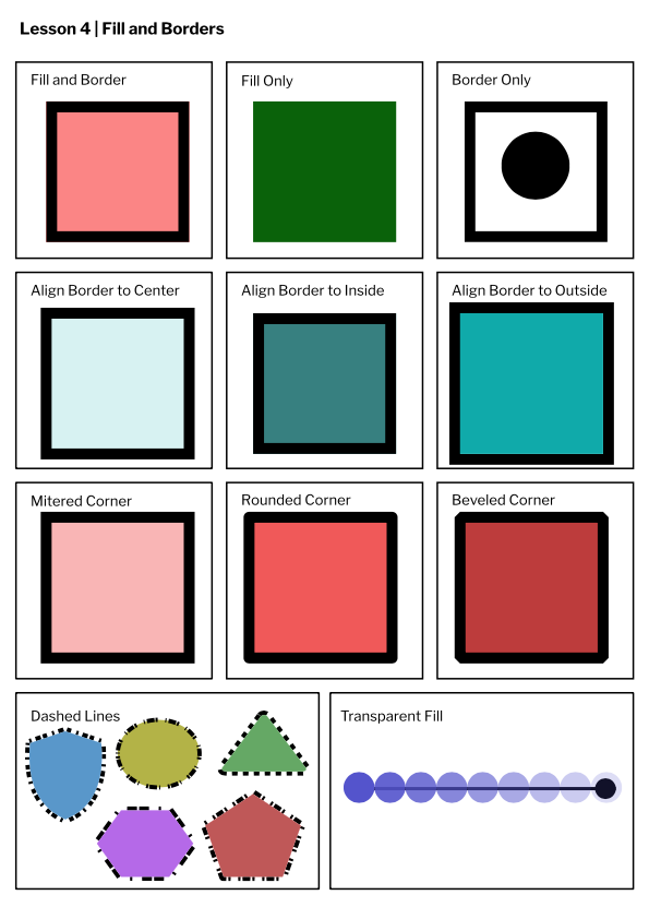
I was asked to make a logo on Gravit Design without using any external support. I used tools such as the compound shape tool, create a shape tool, and the pen tool. Although I used a variety of tools during this summative, I most frequently used the compound shape tool to create the arrowheads. The most challenging thing had to be coming up with a reasonable idea to build off of. By taking my time and attempting multiple new layouts with my logo, I was able to find a few successful outcomes. 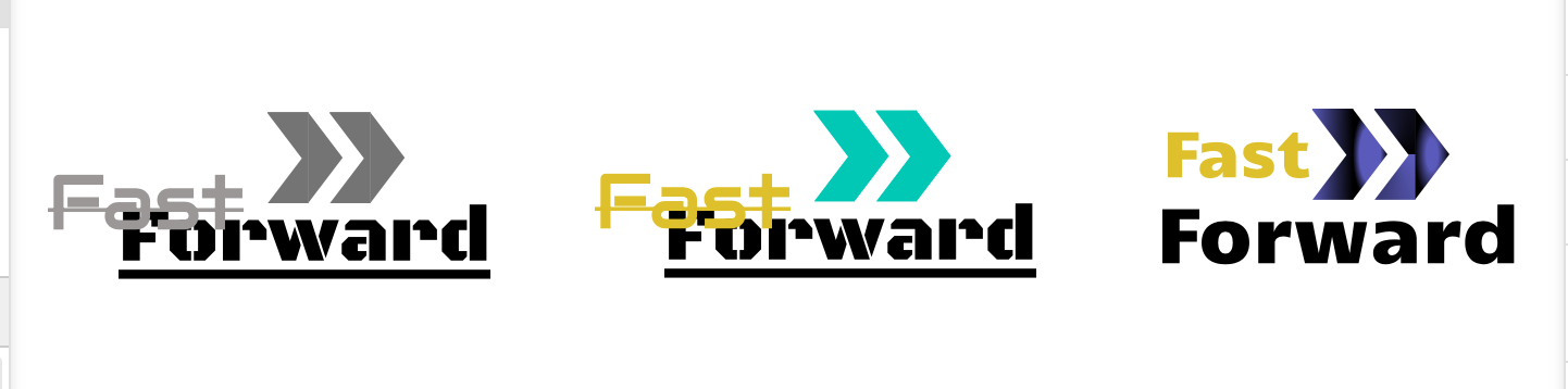 The name of my brand is "Fast Forward", and it represents the internet speed I always desire in my daily life. Everyone has those days when the wifi drops down to 2 bars. This brand will solve all those problems by "fast forwarding" your internet speed. The 2 arrows add a fast and hasty touch to the logo, and a quite literal text. The wording and logo itself go well together, which I think looks exquisite. However, if I were to choose between the 3, it would be the one in the middle for its combination of both color and style. 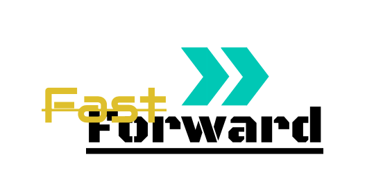 Typography is the art of arranging text and type. It is important for it can attract potential buyers for books, and contributes way more than just being pleasing to the eye. The quote "Each font has a personality and a purpose" means that every font has its own value and fits well with their own situations. We learned about Serif, Sans serif, Monospaced, handwritten and display. Serif fonts have small feet at the end of each letter, whilst sans serif does not. Monospaced fonts have the exact same amount of space in between each letter. Handwritten fonts look like they have been written by hand, and finally display fonts look unique and stand out from the others. Serif is used for formal writing, Sans serif for common events, Monospaced for computer programming, Handwritten for things more casual, and Display for posters or something you want to stand out. Type face comparisonThis was me writing the same phrase 5 times using different fonts to show how salient fonts can be. 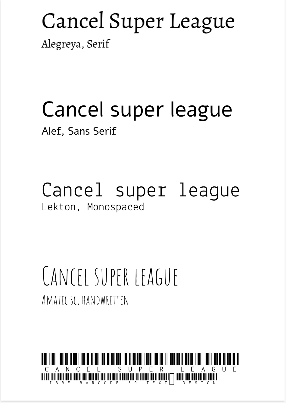 Word portraitsThe image below includes 10 varying fonts using 20 words that work together and don't work together. 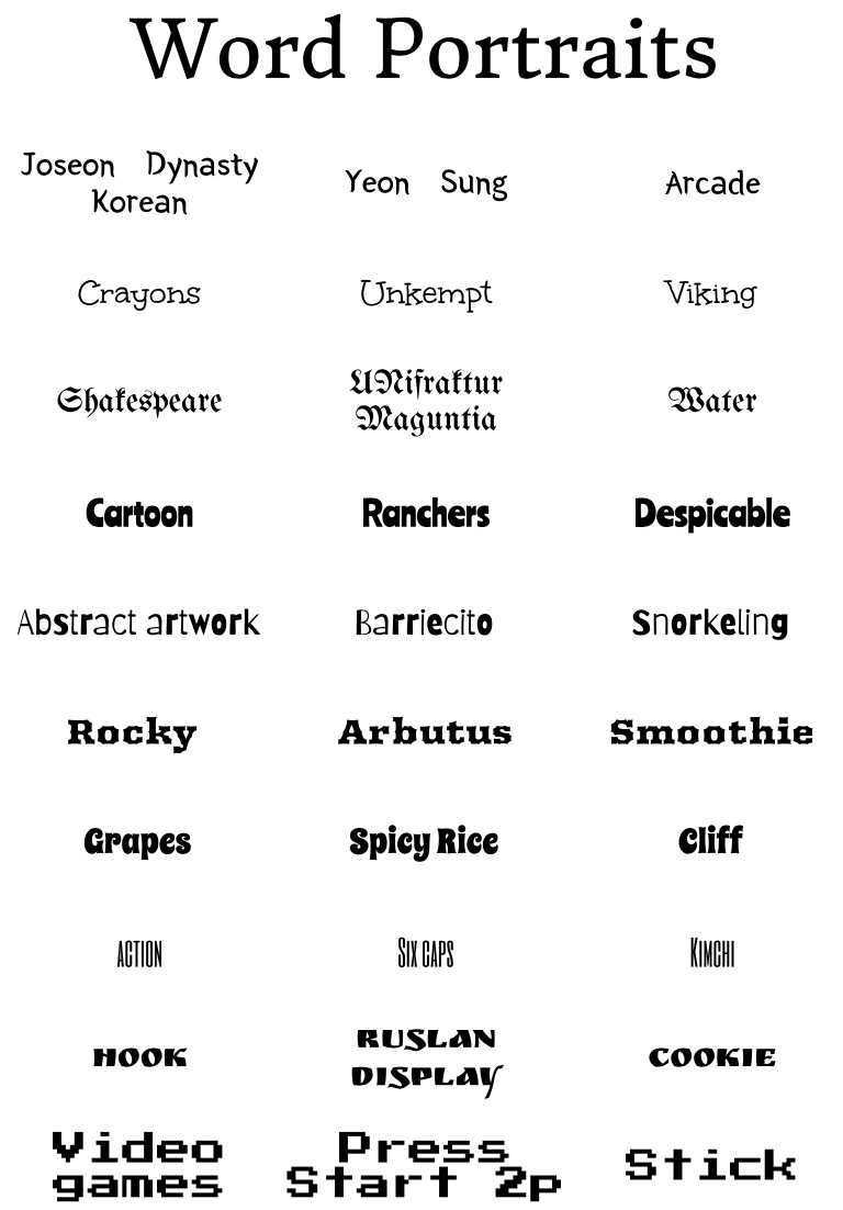 I was assigned to use the pen tool to create a scenery using 2 or more different pictures. The Pen Tool is a brush that paints. It can create non-existent shapes to build new pieces of artwork. Not only is it easy to use, but it can trace both straight lines and curves very accurately. My illustration is just a man at a bowling alley. He mistakes a watermelon as a bowling ball and fires it towards the awaiting pins. Personally, it was challenging to have the lines curve in the way you wanted it. In order to solve this issue, I just spent more time looking closely at the picture. 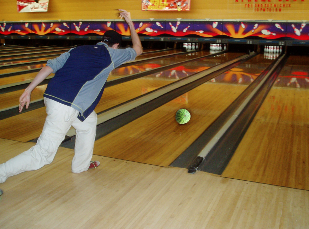 This scene below represents the one time I went on holiday to Guam. This is meaningful to me especially because of the purple fish. I am not 100% sure if it had yellow patterns, but I seem to remember some details from when I was six; It was my birthday, and my family and I went to a beach and had some fun. While I was having a swim with my parents, I realized that there were many varying creatures under my tiny little feet. At that age anything colorful and moving around would draw your attention and I was lucky enough to see fish in the shallow waters. Fascinatingly, one of the fishies took a leap out of the water and dove back in right next to me, and I still feel like this was yesterday which makes this scene special to me. 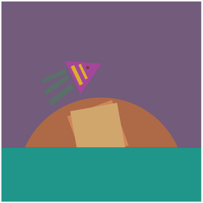 In this lesson, I learned how to modify shapes and use them efficiently in order to create new elements. 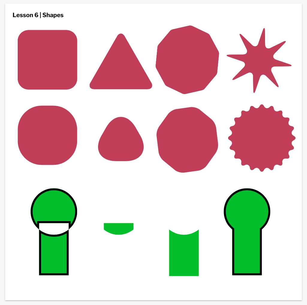 I learned how to layer, group, and organize the shapes and patterns I use. 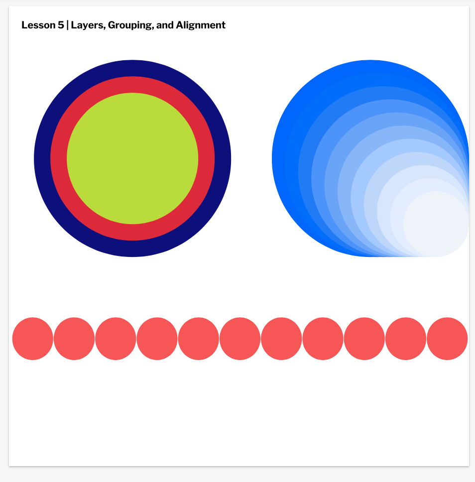 I learned how to use fills and borders the right way, and how it could be useful in further purposes later on.
I learned how to use Gravit more efficiently; By making use of shortcuts and the frequently used tools. 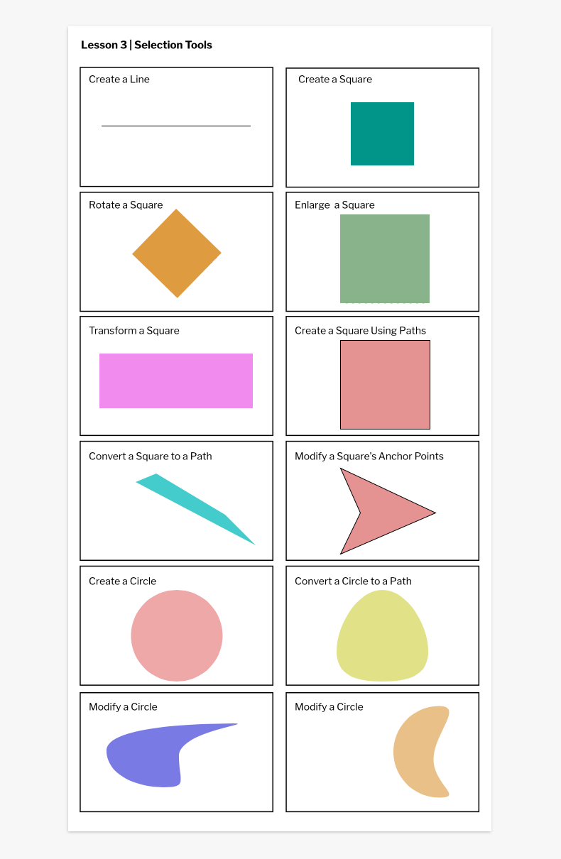 I learned how to use Gravit and how we could possibly use it for in the future. Although I had some problems with Gravit, (I still do) I figured out how to change the sizes, fonts, text elements and more.  |
|
||
 RSS Feed

